To all our creative Color Confidence followers!

18 Feb

Introducing a brand new up to date version of the Pantone Capsure and FHI Color Guide bundle. Treat yourself, your office and your clients to a Pantone Capsure and FHI Color Guide for the chance to accurately measure colours wherever you are, and refer back to all the Fashion and Home set of Pantone colours. This post will explain all the features of the Pantone Capsure and FHI guide and explain how beneficial this bundle can be for you.pant180

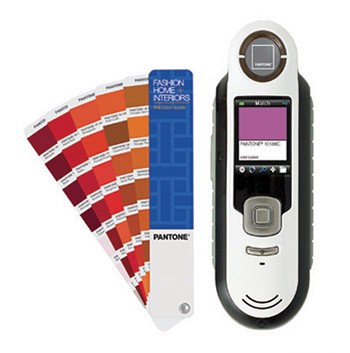
The Pantone Capsure allows you to confidently and accurately capture colour from any surface and match it to the closest official Pantone colour. The Capsure is loaded with over 8,000 colours from 8 different colour guides and the colours you capture can be directly matched to any of these guides for prime accuracy. The Capsure is ideal for fashion, interiors and all creative industries, allowing creatives to use the Capsure portably to match any surface to a Pantone colour, create colour palettes or descriptive mood boards for any project. The screen on the Capsure is 1.75 inch and has a variety of settings, along with providing the page number, sRGB and HTML values, and mixing recipes for the fan guides you choose to correspond the colour you’re matching to. The Capsure uses camera technology to pick up not only spot colours, but also patterns and textures and often provide you with two Pantone matches from one colour swatch. The Pantone Capsure comes with Color Manager software. This allows you to import your colours to the software and create colour ways and palettes. Palettes can be fully integrated and exported quickly and efficiently to Photoshop, Illustrator etc.

img_pantone_capsure_3

The new Pantone FHI Guide gives you 2,100 fashion and home colours on paper in compact and highly portable fan deck. This resource inspires easy colour selection and specification and allows you to communicate your colour choices and ideas with anyone, anywhere.  Each colour swatch has a name and numerical reference. This identification allows for quick decisions and easy referencing which makes it the ideal tool for activities such as client meetings, on site reviews and sample shopping. When using the FHI colour guide, you will have accurate and consistent colour selection on the move.

pant175

Purchasing the Pantone Capsure & FHI Guide will give you the best opportunity to capture your colour and instantly reference it to your fashion and home guide, giving yourself, your customer and your office the best chance for accurate colour management and specification on any project you are working on.

Color Confidence presents this new product bundle to our followers at a brand new, lower than ever price of £499.00!

To read more about this bundle, click here to be taken to the product page:

http://shop.colourconfidence.com/product.php?xProd=5108

Exclusive Pantone Offer

8 Jan

A great new year offer for our Color Confidence followers. Treat your office to a fresh, up to date set of Pantone Plus guides in a convenient carry case. You will receive a 20% discount off the Pantone Plus Essentials, or the Pantone Portable Guide Studio. Alongside this special deal, we will also add a free ColorMunki Smile monitor calibrator that can be used for both home and office use giving you the confidence to viewing those holiday photographs, doing your online shopping and even some work, on an accurately calibrated screen.

What’s more, with this special deal, we will also give you a free ColorMunki Smile monitor calibrator for both home and office use, giving you the happiness and confidence of viewing those holiday photographs, doing your online shopping and even some work, on an accurately calibrated screen.

So, you might be wondering what the difference is between a Pantone Plus Essentials and Pantone Portable Guide Studio and how this will help you and your office achieve the best work you possibly can. Well, with either of these Pantone bundles, you are giving yourself and your co-workers the best for selecting, specifying and communicating colour effectively and accurately in industry.

The guides contain all 1,677 Pantone Plus Series Solid spot colours, also the closest equivalent CMYK colours, and a further 2,868 CMYK colour variations, an essential set of colour guides when designing and communicating with clients in colour. These guides are all accurately reproduced on both coated and uncoated media.

The Pantone Plus Essentials contains the following six Pantone Plus graphics guides:

Pantone Plus Formula Guides contain all 1,677 of the Pantone spot colours with their mixing recipes, printed on both coated and uncoated paper.

Pantone Plus ColorBridge are essential for designers. All 1,677 of the Pantone spot colours alongside their closest CMYK equivalent. Each swatch includes the sRGB and HTML value for each colour printed on both coated and uncoated media.

Pantone Plus CMYK Guides contain an extended range of an additional 2,868 colours in process CMYK printed on coated and uncoated media.

pant269

The Portable Guide Studio offers the complete selection of all Pantone Plus Series Guides. It comprises all six of the Pantone Essentials guides and also includes an additional three fan guides: Metallics, Premium Metallics and Pastel and Neon guides. With these three extra guides, you are expanding your colour palette and ensuring you have as many options as possible when creating your work. In the Portable Guide Studio you will have more than 9,000 market-proven colours allowing you and your office to communicate effectively throughout your industry.

pant270

Along with all this, your free ColorMunki Smile is an easy to use monitor calibrator. It doesn’t require the user to have any colour science knowledge and is able to calibrate any LCD or LED display (laptop or desktop).  It will provide you with a before and after image to show how effective and necessary an accurately colour calibrated monitor can be. The ColorMunki Smile is very quick, and is a great gadget to use at home and in the workplace.

This offer will be ending on 31st January 2014, or until stock lasts.

The Color Confidence Team

Epson microsite launched for all things photo printing

14 Aug

Thinking of getting an Epson D3000?

A long awaited blog post!

Here at Color Confidence we work with some of the leading brands in digital imaging and colour management, one of which being Epson.

Epson have been producing market leading photographic printers for the digital imaging markets for generations. The SureLab range is the latest in their product line and sets the benchmark for Dry Lab accuracy and quality ideally suited to high-end photography print production.

In particular, the D3000 is designed for high-quality photo print production offering a print quality and colour consistency comparable to that of Epson’s professional graphics printers. This means output will appear consistent, giving companies the flexibility to work with a wider range of sizes and print run lengths by using the SL-D3000 in conjunction with another Epson printer.

Our Imaging and Print Division (IPD) works closely with Epson to provide Wet and Dry solutions for all kinds of printing requirements, making best use of our colour management and technical know-how with Epson’s world-renowned, quality printers.

A dedicated website is now available for all things Epson, available at;

www.epson.colorconfidence.com

Exploring the new DxO FilmPack 4

21 Jun

DxO FilmPack 4 Review

This week at CC HQ we had the pleasure of welcoming Hector Martinez from DxO Image Science. He was here to overview the new features of DxO FilmPack 4, which you can now get as a free upgrade from FilmPack 3 if you purchase/(d) from March 1st 2013.

The overall concept is the same: emulating the features and characteristics of traditional film to your digital images. You also get the same ‘essentials’ and ‘expert’ versions of the software as in FilmPack 3.

Rediscover the magic of analog film

courtesy of www.DxO.com

courtesy of http://www.DxO.com

Give your digital photos all the quality and emotion of Fine Art photography, perfectly reproducing the quality, style, colour and grain of the most famous analog films over the years.

The black and white film renderings are arguably the flagship feature of FilmPack 4 (and perhaps the closest match to the excellent Silver Efex Pro we’ve seen since the departure of Nik Software).

FilmPack reproduces numerous black and white films such as Kodak, Tri-X, Fuji, Neopan and Polaroid. Depending on what style of black and white rendering you like, you can select a film effect based on contrast, grain or grey nuances. There are 26 black and white film styles at your disposal, each customisable to suit your creativity.

So what’s new in FilmPack 4?

  1. Textures – A large variety of textures, scratches, grains, spots and ‘paper’ effects are available for that classic ‘vintage’ look 
  2. Light Leaks – Simulate light leaks caused by accidental exposure of film to direct light, causing areas of overexposure or saturation
  3. Frames – Make your image stand out. White, black, mat, darkroom, slide, snapshot, glass, old-style, paper frames are all available to draw attention to your images.
  4. Blur Vignetting – Apply blurred effects to draw attention or focus down on specific areas of your image, simulating the loss of depth of field
  5. Snapshots – (Expert Edition) A Snapshot features allows you to take a /snapshot’ of your images during the course of processing, allowing you to revisit corrections applied later on or for side-by-side comparisons
  6. Favourite Presets – Find and save your favourite or most-used presets and styles for easy application to other digital images
  7. Printing – You can now print directly from the application using the icon
  8. Redesigned Interface – The whole interface had been redesigned to make it easy to explore and apply the styles and settings you want

So what are you waiting for? Get editing now!

The DxO Academy is also worth a mention for those wanting extra videos, images and webinar tutorials, for the entire DxO range. Well worth a look if you want some extra help or guidance for the new products.

If you’d like to watch a full-featured webinar about FilmPack , check the below video:

Come and see us 12/06/13

4 Jun

Color Confidence Drop-in day 12h June

Drop-in day 12th June

WEDNESDAY 12th JUNE marks the next opportunity for you to drop-in to discuss all things colour management.

Quiz the experts

Our experts will be on hand to give you professional product demonstrations and best practice tips to help you get the best out of your equipment.

Whether it’s how to properly profile your printer, which professional monitor will best suit your requirements, or how to use the latest image editing software, our team will be here to help.

What’s on display?

  • A comprehensive range of the latest professional and colour accurate monitors, including the range of new generation LED backlight displays from NEC and Eizo.
  • Monitor and printer calibration devices from X-Rite
  • Extensive image editing software and tutorials with DxO, Franzis and onOne
  • Pantone colour guides –the latest editions and learn which best suit your needs
  • Accessories ranging from Rain Design and Booq, to LMP and a range of Pantone lifestyle products
  • Color Confidence Services – an opportunity to discuss your challenges and how you can benefit from our range of services

Our Drop-in Days take place at our head office in Birmingham, and run from 10:00 to 16:00; best of all, it’s completely FREE.

Register now

TIPA Award-winning Optics Pro 8

23 May

Congratulations to DxO!

As we tweeted a few days ago, Optics Pro 8 from DxO Labs has picked up the TIPA 2013 prize for “best photo software”.

The Technical Image Press Association (TIPA) is composed of the biggest photography magazines in the industry said;

“When you combine the expertise of DxO Labs in image quality with a full-featured Raw converter and image processor, photographers will discover a powerful software tool for image enhancement in one workspace.”

You can read the full release here.

We’ve had DxO as part of our product range for a few months now as we strive to fill the hole left by Nik Software. You may well have seen us demoing it at this year’s Focus on Imaging.

DxO Optics Pro

DxO – particularly Optics Pro 8 – works in harmony with your camera and lens combinations. The software will automatically recognise your camera and lens to provide image corrections based on your kit. Downloadable corrections can also be sourced.

Think of Optics Pro 8 as precision image correction meets creative effects. The idea is to spend more time perusing your passion (taking photographs) and less time in front of your screen editing images.

The DxO website gives a fantastic overview of the product, with lots of interactive demo images and examples.

You can also pick your copy up from us here.

There’s a Pantone universe out there

17 May

When you think of Pantone you probably think of colour charts and codes

But there’s more to Pantone than just assessing colour. There’s a whole universe of Pantone accessories to bring a designer lifestyle to the everyday world.

Pantone Universe

From mugs and coasters, to sugar bowls and coin purses. There’s a host of Pantone accessories available to add some extra colour into your life.

After all, colour is essential to your life. The colours you love are deep and vital affirmations of who you are. Bringing those colours into your day and your environment is the ultimate form of self-expression.

Pantone Universe is a design-led collection for the home, the workplace and the road… Accessories you need in designs you want – and in colours you love, by Pantone, the author of the universal colour language.

Have a look, and add some colour to your much-needed morning coffee boost.

Introducing the latest in Apple cases

10 May

MapiCases are here!

We’re not just about colour management here at CC. If you haven’t had a look already, check out our Apple Accessories section of the website and you’ll see a host of fancy things for iPhone’s, MacBook’s and iPad’s.

The latest of which comes from the guys at MapiCases.

They produce a range of high-quality, 100% genuine cowhide leather iPad, iPhone, smartphone and e-reader accessories.

The cases themselves are durable, easy to care for and resistant to water and dirt. With age, the look and feel of the cases get better to create a more vintage look.

Let’s have a look at two in particular:

MapiCases Kolossa

KolossaKolossa is full cover iPad case that allows for multiple positions for comfortable typing, video or watching films. All ports are accessible in the case and a magnetic cover provides a sleep and wake function on compatible iPads.

MapiCases Alinda

AlindaAlinda is a high-quality 100% leather case for iPhone 5, handcrafted from quality leather with a super-soft lining. The case itself clips onto your belt and rotates 360 degrees for easy access.

To see more of the MapiCases range, click here.

The common question…

19 Apr

Yesterday we spent a very enjoyable day down at LCE Southampton

It’s always good getting out and about and talking to people face to face. It’s something we enjoy, and without wanting to boast, it’s something we’re very good at. We had a great time talking to you all, and we hope you enjoyed our seminar session in the evening.

As ever though, there was one query that stood out above all others:

“My images look great on screen, but don’t look anything like it when printing out” – or in other words; how can I get my printouts to match my screen?

The answer is calibration – a calibration of both a monitor and printer to be precise.

The device capable of performing both is called the ColorMunki Photo from X-Rite.

ColorMunki Photo

Whereas other calibrators will just take care of your screen or projector, the ColorMunki Photo will do your screen as well as any printer(s) you have connected to your laptop, Mac or PC.

Essentially it does the same thing to both devices; namely getting them to display or printout a series of colours for it to measure, compare to what the colour should be and create a profile to compensate for the difference.

Once these profiles are saved and applied to your machine you can start printing with peace of mind what you see on screen is what you’ll see coming out of the printer.

Calibrate your screen once a month and profile your printer for any paper/ink combinations and you’re good to go.

Easy.

You can learn more about ColorMunki Photo here.

Colour management – a refresher

12 Apr

With spring being the time to dust away the cobwebs…

refresher_chews_blog

… we thought we’d do a refresher post about colour management as a whole.

Last week we blogged about the apparent arrival of spring, and a couple of products that would benefit photographers during this time of year. This week we’re going to take a step back and refresh everyone on what colour management actually is, and why it’s important.

What is colour management?

In a nutshell, colour management is the process that helps you keep colour accurate and consistent throughout your workflow. This could be from image capture, to viewing an image on-screen, to printing something out on your printer.

There are numerous solutions and devices out there that help you achieve this accuracy, the process of which is often referred to as ‘calibrating’ or ‘profiling’ your gear. Typically, you can profile your monitor, camera and printer (as eluded to above) to display or process colours as accurately as possible. There are a range of products out there that do this to suit a specific requirement or budget.

Why is it important?

Accuracy is the key word (hence the repetition in the section above!). You want to know what you’re seeing on screen, capturing on your camera or printing out is as true-to-life as possible, especially if your livelihood or reputation depends on it. Effective colour management will help you do this.

No two devices will display colour exactly the same way. Every device will have it’s own colour range or gamut. Even two monitors of the same model and brand can display colour differently. By implementing colour management you can keep colour consistent from device to device, and as accurate as possible within its capabilities.

We’ve blogged specifically about colour management themes before. You can read back through our posts here.

You’ll soon question once you start doing ‘colour management’ how you ever lived without it in the first place!